Enhancing UX and developer collaboration while streamlining our workflow
Upon joining the company, I encountered a lack of structure, notably in communication. The UX team had no direct interaction with developers, relying solely on business analysts for conveying changes and ideas. Consequently, there was a disconnect, leaving us unaware of how the design manifested in production, and hindering open communication between designers and developers.
My role
UX Product Designer
Timeline
October 2023
Four dev teams, no communication
Our UX team consisted of three designers collaborating with four separate developer teams, each dedicated to a specific product. Due to the lack of contact with the dev team and sporadic attendance at stand-ups, there was a mutual unfamiliarity. We didn't know whom to approach for questions, and likewise, the developers faced a similar challenge.
Initiating a call with all development teams to gain insights from their perspective
What we found out...
-
They only want to see the dev ready files
-
Inconsistent Figma designs that don't match the Azure ticket
They prefer the Figma file to contain only "ready for development" designs and exclude ideation or out of scope wireframes, as it can lead to confusion. The underlining issue consisted of poor communication between the BA and UX to ensure timely updates to wireframes when features are out of scope.

Azure ticket with an out of scope item, which has not been communicated

Before, this is how out of scope items were placed outside the section
They expressed that additional specification tools such as EightShapes are unnecessary, as they find Dev Mode sufficient. They particularly value the usefulness of the Autoflow plugin.
They are content with using dev mode and do not require additional annotations.
Autoflow plugin
EightShapes plugin (not necessary)
Including component specs into the flows clutters the page
Since the design system is still a work in progress, we need to temporarily include components directly in the wireframes, such as toast alerts.

Component specs placed within the flow
They don't know what the before looks like
A current challenge they experience is the uncertainty about design changes and the original appearance. Although we discussed integrating Zeplin, the implementation is slated for a later time.
We all agreed that we need to enhance communication between us
We've determined that enhancing communication is essential, regardless of time zone differences and it was the contributing factor to all our issues. This can be accomplished through the use of Teams messages, email, leaving comments in Figma, and scheduling calls fortnightly.
Coming up with ideas/solutions
-
They only want to see the dev ready files
-
Inconsistent Figma designs that don't match the Azure ticket
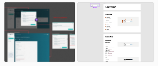
Solution: Creating an ideation folder.
.png)
1 ideation (UX) folder, 2 Signed off (ready for dev) folders
We opted to enhance efficiency by segregating ideation from development readiness. Consequently, we established a dedicated UX folder for testing designs and storing out-of-scope wireframes for potential future use.
Including the component specification creates clutter on the page.
Pending: We have to wait for the Design System to be finilised.
Since the design system is still a work in progress, we need to temporarily include components directly in the wireframes, such as toast alerts. The plan is to eventually complete the design system and establish a comprehensive component library in Storybook.

-
They don't know what the before looks like.
-
Locating the desired wireframe isn't always straightforward for them.
-
Adding component variations clutters the page, leading to confusion.
Competitors break up each flow into files.
Having separate files for each flow isn't ideal due to the numerous flows we have. This would require developers to exit the Figma file and search for the specific flow they need. Additionally, some flows may be interconnected, so consolidating everything into one file would be more efficient.

Competitors

Control Risks
Our solution
Final solution: Top of page displays design sign-off date, updates with links, and lead front-end developer. Pages separated by sprint with corresponding wireframes and ticket numbers. Master page at the top shows the entire flow. Additional space on sprint pages allows for inclusion of component guidelines with a link. Optional section with before and after for clarity on changes.

Picture of the process illustrated on a whiteboard from our office, explaining this approach to the other designers

The master page is the ultimate source of truth, comprising the latest design changes.
To prevent clutter, a maximum of five sprints will be displayed simultaneously.
The present sprint will be positioned at the bottom of the list, with the addition of the term "current" to distinctly indicate its status.

Categorising the section by ticket numbers. The text is clickable and directs the dev/BA/QA to the Azure ticket.
Section title is the ticket title in Azure.
Displaying the before and after of the design. Highlighting which section has been amended, with added comments.
Displaying the date the design was approved.
Adding the sprint number.
To clarify important points, explanations are added under the wireframe.
See it in action!

Using new Figma plugins to ensure consistency and avoid confusion from the engineers
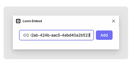
To ensure clarity and consistency, I've started using two new Figma plugins. One plugin, called Design Lint, verifies selected layers, ensuring consistency in variables such as corner radius and fill colour. The other plugin allows me to embed Loom videos where I explain the design process.

Design Lint plugin
.png)
.png)
Loom Embed plugin
Following the design handoff, there was no follow-up or request for our review
Another issue we faced was that after completing the design, we forwarded it to development. However, following this, there was no request for testing to ensure alignment with our version and to verify if the behaviour matched the intended design.
We determined that following each sprint, during the QA process, designers will collaborate with QAs to test whether the design aligns with the specifications outlined in our Figma files.

DESIGN
Source: blog.zeplin.io
How did this initiative go?
Closer relationship between us
Within a few weeks, I observed a shift as developers began reaching out, seeking my opinion and clarification on ambiguous aspects.
Components had the right behaviour
As a designer, it was occasionally challenging to determine if our handoff was comprehensive, especially with numerous edge cases that only developers might consider. However, as developers began seeking clarification on the intended behavior, it ensured that the design in production aligned precisely with our intentions.
Improved development process
The improved organization of the Figma file led to positive feedback from developers, who expressed a sense of enhanced workflow efficiency, noting a reduced need for extended searches to locate specific wireframes.
UX testing