top of page
Prioritising the highest-priority components accelerated the design process
Below are a few examples of the components I created as part of our design system creation process, accompanied by videos showcasing variables, guidelines, and the thought process behind my decisions.
My role
UX Product Designer
Timeline
October 2023 - TBC
The design system was a collaborative effort by the design team, but all the components presented below were individually created by me.
Checkbox and Radio button
The absence of a design system hindered the design process, leading to inconsistency with other products and the need to create most components from scratch.

New instance

Wrapped labels
We missed a scenario where the label appears as a confirmatory message. In such cases, the checkbox should remain at the top. However, with the existing settings, the checkbox ended up positioned at the far top-left of the container, creating an awkward appearance. I had to revise the layout settings entirely to ensure proper alignment of the checkbox.

Opting for the default auto layout settings would have resulted in the checkbox being positioned similarly to the example disaplayed above.

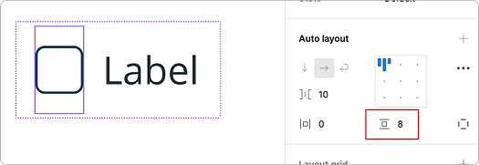
I had to manipulate the auto-layout settings and apply custom paddings to each element. This was necessary to ensure proper alignment between the checkbox and the text.

Additionally, I implemented a maximum width to prevent the text from spanning too long, ensuring a more visually balanced layout.
Tooltip
The absence of a design system hindered the design process, leading to inconsistency with other products and the need to create most components from scratch.


Collecting all tooltip variations
I gathered button variations from five different products to identify the diverse button styles required for a comprehensive design system.


Adding constraints
I implemented a maximum width for the tooltip to prevent it from spanning too long and potentially obscuring other important content on the screen.
Breadcrumb
The absence of a design system hindered the design process, leading to inconsistency with other products and the need to create most components from scratch.


Sufficient states and variations
I ensured that the components had an adequate number of states and variations, including icons, hover, pressed, and current screen, among others.
Popover menu
The absence of a design system hindered the design process, leading to inconsistency with other products and the need to create most components from scratch.


Sufficient states and variations
I ensured that the components had an adequate number of states and variations, including icons, hover, pressed, and current screen, among others.
Icons subtly lighter than label
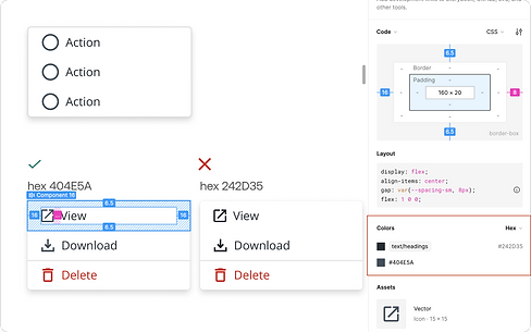
Opting for a shade slightly lighter than the label colour for the icons aims to minimise their prominence. To provide context, the current hex code used for the menu item label is 242D35, while the icons use the hex code 404E5A.
Callout
The absence of a design system hindered the design process, leading to inconsistency with other products and the need to create most components from scratch.
bottom of page