Transitioning from a nonexistent design system to one that accelerated our workflow and enhanced efficiency
Being the second UX designer ever hired at the company, there was a lack of UX maturity. The initial UX designer made earnest efforts to balance managing expectations and reusing components whenever feasible. However, the solitary position on the team subjected her to significant pressure.
My role
UX Product Designer
Timeline
October 2023 - TBC
Core responsabilities
Structure, variables, communication. All components presented have been created by me.
What prompted the serious consideration of a design system?
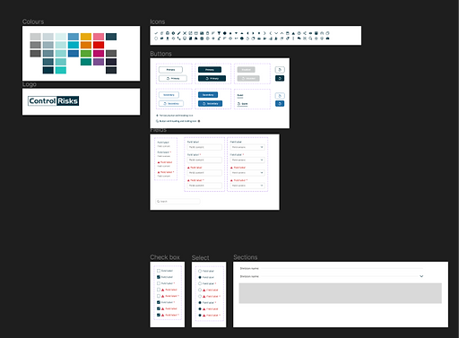
The initial component library we adhered to
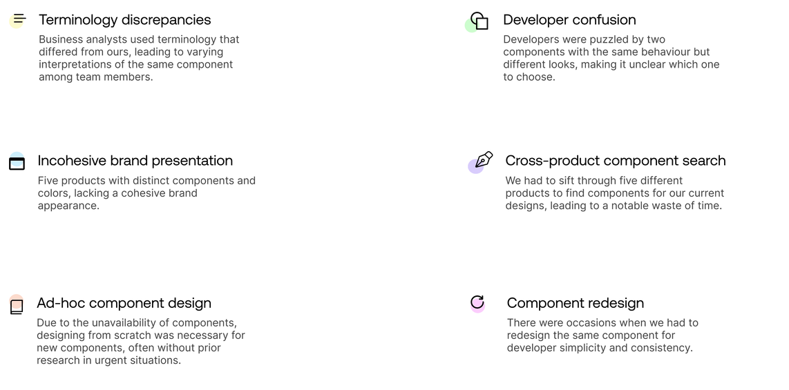
The absence of a design system hindered the design process, leading to inconsistency with other products and the need to create most components from scratch.
When I first joined CR
We had only buttons, lacking state variations, icons, logos, colors, and text fields as reference points during the design process
A few months after

A few months into the role, I opted to incorporate many components used in other products, aiming for awareness of various variations, which explains the abundance of comments and lack of tidiness
Step 1: Conducting research
The initial step in constructing a design system involves studying other companies, acquiring knowledge on proper construction, and obtaining detailed information about each added component.

I conducted research using reputable sources like NN/g, along with articles, websites, and guidance from mentors. The session was well-structured, with predefined questions to keep the meeting focused
Following that, we opted to examine competitors and analyse their design systems, exploring their structure, documentation methods, and storage practices.


I selected Sainsbury's Design System (Luna), Microsoft's (Fluent), and Gov UK, renowned for being one of the most accessible design systems, as a few of the competitors to study
Step 2: Coming up with a strategy


Source: Design system Checklist
1.
Designers assign themselves one component per week, with the option to take more if capacity allows.
2.
Project-related tasks always receive priority.
3.
Weekly workshops are held where designers present and align on their chosen components, discussing potential edge cases.
4.
Monthly calls with the marketing lead assess alignment with brand guidelines.
Some of the first issues we tried to fix
Before
Numerous inconsistencies existed across all products, including issues with text contrast ratios, the absence of an 8pt grid spacing system, and the use of different typeface families.


Buttons

1. Collecting all button variations
I gathered button variations from five different products to identify the diverse button styles required for a comprehensive design system.

2. It gets worse before it gets better...
Creating a design system can become messy at times, as was the case here. I had to initially determine the button structure before organizing them systematically.
Version 1.0
With constant communication and feedback from the other two designers, Version 1 was completed. It was then time to present these to the team and incorporate any necessary changes.
After our weekly workshop, I implemented numerous changes. We deliberated various edge cases, diverse applications, and guidelines. Our manager provided assistance to ensure alignment and offered feedback.


We recognised that the large buttons (48px height) were only necessary at the end of a form as a primary button. Consequently, we eliminated the other secondary buttons and those with the icon left layout style

We also recognised instances where we employ the destructive button action. Hence, we decided to incorporate it as a variant
Final version

The ultimate version incorporated various button types, including primary, secondary, loading, split, and others
Input fields
Research
Before developing any component, I ensured thorough research to encompass all possible variations of the component and cater to our diverse needs.

I frequently discovered excellent articles on components and design systems via LinkedIn and newsletters.
Version 1.3
The text fields underwent a few iterations, although the changes were not overly significant. We ultimately settled on the version below.
Part 1

Part 2

Version 1.4 (final)
After testing the component, I identified areas for improvement in the text fields. Implementing these changes would enhance the design process efficiency and improve the overall user experience.

Initially, I included a callout at the top of the page for users who did not complete all mandatory fields

However, I realized it would be more effective if these messages appeared dynamically. After a discussion with the development team, we concluded that this approach would be optimal

Upon testing, the UX team raised concerns about text fields not resizing. The issue was attributed to suboptimal use of autolayout properties. After several iterations, I successfully made the text fields responsive.

During our weekly workshops, we encountered some misalignments with one of the designers who preferred to use the input text at 14px instead of the accessible 16px. We decided to conduct tests with actual users (200+), particularly those extensively using our products, to derive conclusions and make informed decisions. Survey results TBC.
Popover... how building the base components sped up the process
We opted to begin with the fundamental components to ensure that when constructing more intricate elements such as popovers, we could easily reuse buttons, input fields, checkboxes, etc. This significantly accelerated the process.


In the given example, the buttons, input fields, and checkboxes had already been designed, making it effortless to reuse them.
Component QA
Before presenting the components to the rest of the team, I conducted a QA test to ensure alignment with UX best practices. I aimed to preemptively address questions such as:
“Why don’t we have this variation?”
“It breaks with a reasonably long label.”
“Did you check for accessibility?”


I tested all components in dev mode to ensure that developers have all the necessary information and to verify that the spacing is correct
I also ensured that all components had various states and variations, including default, hover, pressed, disabled, error, with helper text, without, with icon, without icons, etc.

One of the most important things I did to ensure accessibility was to check all colors with the stark contrast checker. This was crucial because the colors were not initially a part of the design system

Components were also connected to tokens, including color and icons

I also ensured that all components resized accordingly to accommodate different inputs
High-level roadmap for staying on track

We needed to outline a plan for when the design system is completed. This would serve as a high-level overview, with further details to be developed once the design system is finalised. In a conversation with the developers, we discovered that among the five dev teams, only one utilises Storybook. The remaining teams rely on Confluence to store their component library. This underscores the importance of finalising the design system and establishing a central repository accessible to all teams
The maturation process
Experience is not something that you can get from a Figma Plugin or from the output of a chatbot. It only comes from exposure — from exposing the components and patterns from actually using it. We opted not to send designs for development immediately upon completion. This decision allows us to test them in the context of actual designs, ensuring alignment with our branding and suitability for our requirements.
.webp)
Having regular calls with the dev team led to eye-opening discussions

Upon presenting this component to the developers, they raised concerns and initiated a discussion. Their primary argument centered around the completed state, expressing that it is not considered a good practice to make users wait before they can take further action.
- We ended up removing the completed state.
Another concern raised was related to multiple file uploads. In the previous version, the Uploading 3/5 loading button style was used to indicate the progress of file uploads. However, this approach posed a limitation – the user couldn't initiate another upload while the button was in the loading state. To address this issue, a new component was essential, providing users with visibility into the file upload progress and the flexibility to initiate additional uploads concurrently.
- Adding the "File upload progress loader" component.
Previous loading button component
We opted to eliminate the "completed" loading button state. Instead, we introduced new components and rules for the file upload progress loader, placing it on a dedicated page with a convenient link for easy navigation. The new component facilitates multiple file uploads, ensuring continuous user awareness throughout the process.

Current loading button component
File upload progress loader
Documentation, proposing changes and adding new components OR Design system adoption - figma analytics
Conveying the significance of a design system to the rest of the team and SLT (Senior Leadership Team)
Due to the lack of UX maturity before the arrival of myself and the other designer, the team and other departments found it challenging to perceive the value in a design system. We decided to seize an opportune moment to present what a design system is and why it is important. This goal was accomplished during one of our workshops, where the entire team convenes.
This slide illustrated the significance of the design system and how it will enhance efficiency.


The screenshot on the left depicts a timer showing the process of building a button from scratch and incorporating it into a wireframe. It illustrates that the process took an additional 1 minute and 30 seconds to accomplish the same task in the absence of a design system, thereby putting the issue into context.