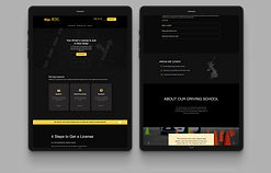
Student Feedback Panel
A place for the university to collect students interested in giving their feedback on their experience studying at Anglia Ruskin University (ARU). I was responsible for the end-to-end process (planning, research, analysing, designing, and marketing). I reported to the line manager (Lead UX Designer).
Project context
University- sponsored project
Launch: September '22
Timeline
May '22 - Aug '22

Understanding the problem by collecting previous student feedback
As part of previous diary studies, the UX team conducted interviews and identified many issues with system processes as well as the way lectures were conducted, students' onboarding experience, etc. Below is some of the feedback the UX team were able to collect as part of a previous project.

Seeing what students are affected the most by analysing the segmentation
Instead of creating personas, we collected real demographic data using the university's analytics platform. We were able to find the latest information about whether students were living in the UK or coming from overseas or Europe; how many students were in each faculty and how many students were studying on each campus.

Where are they living?
Most students live in the UK. However, 26% of students were overseas and international students
Campus location
A mix of Chelsmford, Cambridge and Peterborough students

Faculty
Four different faculties: Business, Architecture, Medicine, Arts, Science and Engineering
Key challenges and constraints
APPLICATION OVERLOAD
Students reported feeling overwhelmed by the number of digital systems they had to become familiar with.
01
02
LIMITED BUDGET
The university did not have the resources necessary to go beyond the MVP stage.
03
DESIGN REQUIREMENTS
The university had strict design requirements and guidelines that we had to comply with.
ARU has no direct way of collecting feedback therefore students' concerns remain unheard, leading to decreased customer retention.
Project planning
Designing the agile way: splitting the project into 2-week sprints.

Using gamification strategies to attract students to our panel
All competitors had the rewarding factor that was used to attract customers in giving their feedback. Although analysing the competition gave us some insights into how we can reward our participants, as part of a higher education institution, we had to find a relevant and attractive way to reward students.


User flow and Blueprint diagram
Designing for the user experience began by sketching out a typical user journey. Once the user journey had been established, we began to unpack the design flow for our use case. The diagram includes the user actions as well as backend support and admin processes.
Given that students reported feeling overwhelmed by the number of apps they needed to get familiar with, we decided to stick with something that most of them have probably used before, therefore we used MS Teams and Ms SharePoint.

Testing the panel with 1st, 2nd and 3rd year students
The overall feedback following the two rounds of usability study sessions was positive. The students found it easy to navigate through both sections of the panel (Community Help Area and Discussion Area) and were content with the amount of information displayed. However, there were some aspects of the panel that needed to be changed.


How will students find out about the panel?
Looking at previous statistics, students come on campus an average of 2-3 times per week. We, therefore, thought of advertising the panel using virtual display boards. The university has 4 info kiosks and 22 info screens across all campuses and a mobile app, as well as a marketing email campaign for those who do not attend campus on a regular basis.

Main page iterations

Adding a student ambassador to each MS Teams channel
When asked if they would find themselves taking part in discussions, students expressed they would feel intimidated therefore they would not be the ones to add the first comment to a discussion.
We thought of mitigating this issue by adding a student ambassador to each channel so they can motivate other students to take part in discussions.
The sign-up page was moved from MS SharePoint to Canva
While building the sign-up page, I encountered a major permission issue. By having access to the sign-up page, students automatically had access to the panel without being a member. We wanted to prevent that and be in control of who is a panel member, therefore we created a separate external page (using Canva) to function as the sign-up page.


Tracking performance for each version of the virtual display boards (A/B testing)
Students reported that although the yellow version of the virtual display boards complies with the overall brand guidelines, they wouldn't find themselves paying much attention to them as they look so similar to the rest of the virtual display boards.
We decided to create different versions and test each version during the first weeks of launching. The number of scans for the QR Code will be indicative of which version attracted the attention of students the most.

The Help section has been changed to be more descriptive.
Difficulty reading long lines of text. The new design had text that is easy to skim.
No descriptive section title. New design gave more information about the rewards sections.
The image was not accessible on mobile viewports therefore was replaced with a banner.
Next steps
-
Integrating with a CRM system to keep a record of each student’s information. Having this information allows for the most relevant activities to be sent to students.
-
Recruiting a designated person that would manage the panel: post activities, accept people into the panel, reply to queries, manage behaviour.
-
Tracking panel performance using SharePoint analytics (time spent on site, site visits, bounce rate, etc.).
-
Automating the rewarding process - integrating with a digital credential platform (Credly, Badgr).
Conclusions
What I'd improve next time
-
Document everything. Despite trying to document every step over the course of this project, after my internship ended and I lost access to all the resources I had, I realised that I should have focused on documenting different iterations a lot more.
-
Ask for more feedback. Although I felt I was receiving enough feedback during the catch-up sessions we had each week, in future I will seek bi-weekly feedback on projects to ensure that I am seeing the full picture.
-
Focus on improving interviewing skills. This was the first time I interviewed people as part of a usability testing session, therefore I often found myself stuttering and feeling nervous. I've since researched more on how to practice and better conduct user interviews.
Update 7 April 2024
As my university offers free access to the library and it provides an ideal environment for working, I make it a weekly habit to come here to focus on my personal projects. To my pleasant surprise, one day I noticed that the panel I had worked on was implemented. While it appears somewhat different from our initial design discussions, I'm happy to see that elements from my original design were retained.