top of page
Top
Pizza GoGo Project Redesign
A pizza app redesign that facilitates the sales funnel and increases customer retention by making the user journey more intuitive.
Role
Solo UX Designer
Timeline
Jan '22 - Mar '22

Click to see prototype
Understanding the problem
Marketing strategies were not effective
As a customer, I used to order takeaway from Pizza GoGo via UberEats. Every time the order arrived, the restaurant made sure they added a discount flyer that would work only when ordering from their app. Although a good marketing strategy, this didn’t seem to be very effective.
Market research
Customers end up paying an extra 17-40.5% more when ordering via third-party platforms
While doing some research, I found out that consumers risk paying a lot more when deciding to use third-party delivery platforms compared to going directly to the restaurant’s app.

Usability testing
Looking for answers, I decided to analyse their app and identify some possible reasons.
USABILITY
Faulty navigation and confusing information architecture that hinders usability.
CONSISTENCY AND STANDARDS
No standard navigation, repetitive pages, inconsistent buttons.
AESTHETICS & MINIMALITY
Low-quality photos, cluttered design, poor colour contrast (non WCAG compliant).
VISIBILITY OF SYSTEM STATUS
No clear indication of the items added to order.
ACCESSIBILITY
Hidden drop down menus making it hard for the user to find vegetarian, gluten free options.
COMMUNICATION
The item description does not give enough information about the product.

Analysing the competition

I decided to analyse both direct and indirect competitors. This helped identify areas of strength and weakness relative to the product, and also ways that I could differentiate my offering. I also gathered valuable insights from the feedback customers left on Apple Store.
Interviewing 3 people who have ordered a takeaway online in the last 6 months
I was able to identify the target demographic by doing research on the average weekly household expenditure on takeaway meals in the UK (2020) by age of the reference person. I interviewed 4 people that fit within that demographic (20-30 years old) and also put together a 13-question survey which was posted in a Facebook group. Questions asked during the interview focused on understanding customers’ experience while ordering takeaway, the pain points they usually encounter and what they wish the perfect app would be.


Affinity diagram
Major insights and uncovered issues
01
Lack of item information
Interviewees would like to see product description and pictures. Ordering items without a picture often leaves my participants guessing.
02
The checkout process takes to long
Interviewees expressed frustration when the ordering process takes too long. Most of them would want to have their details saved so that they can order more quickly.
03
Lack of updates and track order functionality
The app never shows where the driver actually is. Interviewees want to be informed when their order will arrive and be notified if circumstances change as well as have the option to reach out to the driver or restaurant quickly.


Persona pain points - merging insights into real-life opportunities

Customer journey map (as is) - presenting the pain points in order to find opportunities and areas of improvement
Users want to order quickly and have a variety of features while the restaurant wants to create its own client base and pay fewer commission fees
What the new design will be able to offer?
Food customisation for different tastes and people with food allergy.
Schedule order option to allow users to fit ordering within their lifestyle.
Splitting the bill feature to help users save money.
Detailed description of the ingredients and nutritional values of the food.
Balanced number of food options to give the users options but not overwhelm them with choices.
Ideation: Targeting user pain points
I decided on redesigning the elements based on the most common pain points users are experiencing and focusing on organising the layout in a way that would take minimal cognitive requirements from users as well as providing enough functionality to make the ordering experience pleasant.

Design and sketches
Paper sketches were followed by lo-fi prototypes. I envisioned the entire design to consist of primarily modals which makes it easier for customers to return to the previous screen.

Testing the prototype with 12 participants and iterating based on insights
In order to evaluate the prototype’s usability, I conducted a remote, unmoderated task-based usability study with 12 participants using a product research platform (Maze). The study focused on asking users to perform benchmark tasks and prompt participants to give feedback following task completion.


Final design
-
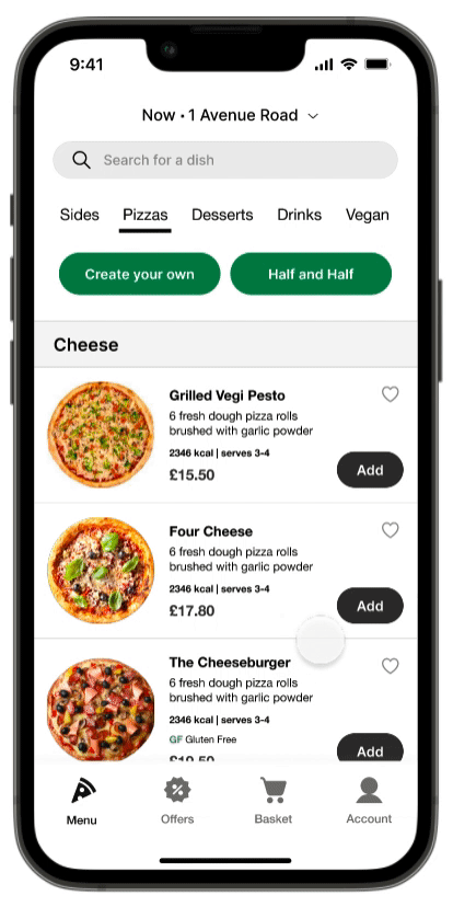
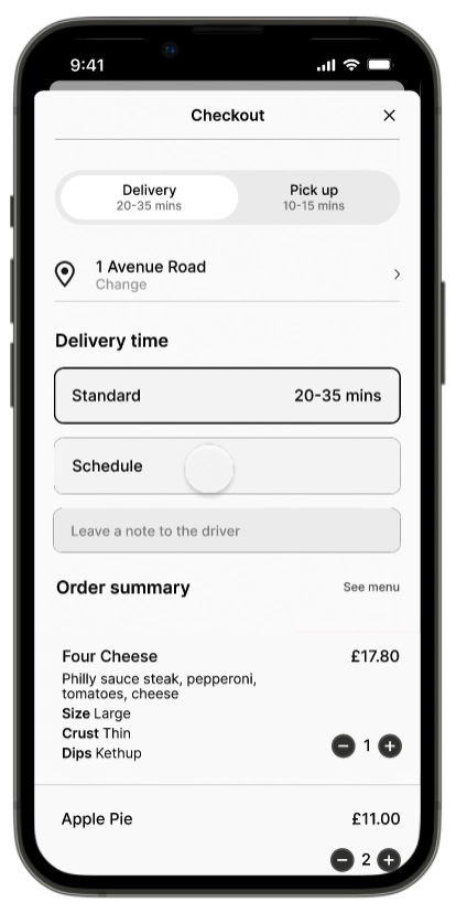
The addition of a bottom navigation bar simplifies the ordering process.
-
When adding an item to order, a full-screen modal opens up with all the customisation opens which makes it easier fro customers to get back to the previous screen.
-
Post descriptions have been optimised to include all the necessary information (ingredients, nutritional value, serving, price) as well as the option to add the item to favourites.
-
I have added a scheduling feature so that customers are able to fit ordering within their lifestyle.
-
A nice feature to have to allow the convenience of splitting order is having a "split the bill" option.
-
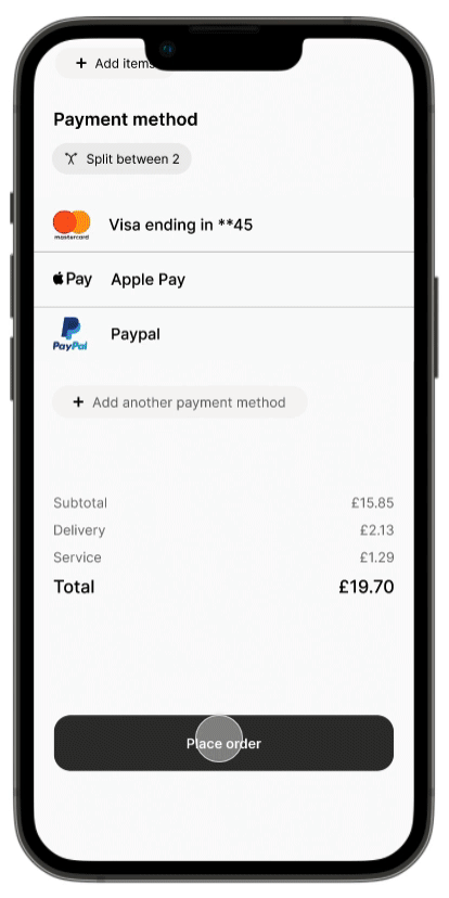
To speed up the checkout process, a save card feature was added.
-
After placing an order, customers can get live updates on their order.
-
I have added 3 different screens:
- update of their order being placed with a breakdown of their order and the option to cancel.
- an update of the order being received.
- the addition of a map as well as the driver's information makes it very easy for the customer to track their order as well as get in touch with both the driver and the restaurant quickly.

Style guide
Reflecting on the project
-
Make the insights more relevant. Have a screener survey to ensure that all participants are within the target demographic.
-
Focus more on functionality rather than visuals. The first version of this project was focused on the visual part rather than the usability.
-
Iterate as much as you can. Despite having 3 drafts of how i envisioned the app to look, i think a final one would’ve been necessary.
-
Increase sample size and interview people in situ.
-
Conduct a final round of usability tests.
Thank you for reading this far :)
View other projects...


bottom of page