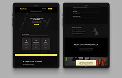
Improving the SIREN Network - an international software collaboration project created to protect endangered marine animals
In 2012 AMMCO created SIREN, a collaborative citizen science platform with the mission to help coastal communities, governments and scientists to study and protect endangered marine species. Since then the platform evolved to a website and a mobile applications for specific geographical conservation efforts.
How it works? Imagine fishermen around the world taking photos of sharks, rays, dolphins on their phones and uploading those to the SIREN platform where scientists can analyze the observations and work with local governments to protect those species and create marine protected areas.
My role
UX Designer (mobile application and website)
Team
3 UX Designers
1 Project Lead
5 Engineers
1 Field Assistant
Timeline
November 2022
Tools
Figma
Miro
Gitlab
Slack

Marine fauna across Africa's coasts faces a range of challenges, including threats that can lead to extinction or population decline. Some of the major issues affecting marine fauna in this region include:
Overfishing is a severe threat to marine life along Africa's coasts. It can lead to the depletion of fish stocks, disrupt ecosystems, and harm local communities dependent on fishing.
Pollution, including plastic pollution, oil spills, and runoff from land-based sources, poses a significant threat to marine life.
Illegal, Unreported, and Unregulated (IUU) Fishing. IUU fishing is a significant problem along Africa's coasts, contributing to overfishing and economic losses.

National Geographic has, for the third time, pledged a generous $500,000 grant to support AMMCO (African Marine and Coastal Conservation Organisation) in its critical mission to protect Africa's coastal marine ecosystems. Find out more .
How it works...

Step 2: Data collected from fishermen is transmitted to the database, where administrators can review and authenticate it.
Step 1: Fishermen use the button (FAB) to capture an image of a marine animal that may be deceased or displaying signs of illness.
Case study contents
1. Research
Qualitative research - heuristic evaluation, user interviews
2. Map and list view
Purpose, iterations
3. CRUD popups
User story, ideation, iterations, developer handoff
4. Usability testing
5. User manual
Where, why, how and who is using the app?
I have conducted primary research with 3 of our target users - fishermen (40 years old average age).
-
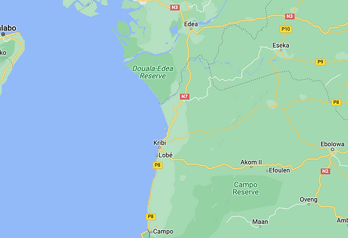
Fishermen in areas close to the seashore in Cameroon.
-
They are usually using Android phones with limited storage and poor internet connection (1/2G).
-
They wake up around 3 am and go to the seashore with a boat to catch fish and then sell it at the fishmarket.
-
Some have not used any mobile app so far because no one taught them how to use it.
Challenges
No internet connection at the sea.
Network is terrible, unstable, not even able to make a call.
They have a few minutes or even seconds to document/create observations of what they have caught.
"App fatigue" - having a very intuitive interface.
Heuristic evaluation (web)
I have evaluated the design against Nielsen's 10 usability heuristics, noted areas of improvement, prioritised issues based on severity and made recommendations for how to address the issues.

-
Aesthetic and minimalist design. No primary colour and too many secondary colours.
-
Consistency and standards. Unticking the boxes in the left hand side menu led to no changes; when clicking on each tick, text is in French even though the language is set to English.
-
Recognition rather than recall. When selecting the end date, there is no clear indication of the start date.
-
Generate button did not create any outputs.
-
Error prevention. I shouldn’t be able to select a date in the future (picture 3).


-
Consistency and standards: I could not find the extension for my country as the language was set to French.
-
Recognition rather than recall. No option to check my password.
-
Consistency and standards. The contrast check did not pass WCAG standards.
Map and list view: platform where administrators can access all observations collected by fishermenform where administrators can access all the observations collected by fishermen.
The map and list view is the platform where administrators can access all the observations collected by fishermen. Within this view, administrators review the coordinates, timestamp of the image, and make the determination to validate or reject the observation.


Testing various versions, specifically around the toolbar.

Designing the map and list view involved collaborative discussions, where we explored various options, provided reasoning for our choices, and ultimately reached a consensus.
Figma display of our comments and iterations.
Issue #303 - Allowing admins to create, view, upload and edit observations (CRUD popups)
Context
Once the fishermen upload their observations through their mobile phones, they are transferred to our cloud-based software, Siren. This platform provides access to all admins who can view and manage the observations. The admins have the ability to view a comprehensive list of all observations and can edit, validate, and even create new ones.
As part of my responsibilities, I am tasked with designing a user-friendly interface that enables the admins to easily view, edit, and create new observations.
User story

Ideation and iterations
Once we have reviewed our research notes and created a user story, it is time to move on to the design stage. I was handed an initial wireframe that I had to finalise.


Iteration 1: Edit & Create observation

Iteration 2: View observation

Iteration 3: Edit observation
Fitt's law and improved layout
I decided to elongate the popup and move the map and images to the top. I have also increased the size of the text fields and added more white space to make the design look more spacious. Additionally, I have decreased the height of the popup and added a scroller to enable scrolling.
In accordance with Fitts' law, I have removed unnecessary secondary buttons from the bottom of the popup, leaving only the most important ones.


Iteration 1: View and upload images
Iteration 2: View and upload images

Iteration 2: Delete images
The final design features create, view, and edit popups that are clean, minimalist, and not too cluttered. This approach ensures that users can easily interact with the application without any distractions or confusion.


Developer handoff
Initially, the handoff was facilitated through a link to the Figma file. However, considering the poor internet connectivity in some African regions, developers are now provided with PDF files containing all the necessary information that can be downloaded without relying on an internet connection.


Usability testing (6 remote moderated usability tests). View detailed description of the process
We conducted usability tests with 5 participants whose first language is French. As a result, some sessions ran longer, and the project lead occasionally had to step in to translate English words into French. Additionally, a few sessions had to be rescheduled due to poor network connections.


Session planning
1. Test setup
-
Thoroughly prepare the script in advance.
-
Conduct a pilot study before the session.
-
Utilize Zoom and Google Form for tasks, including the distribution of the SUS survey.
2. Team
-
A team consisting of 3 UX Designers.
-
1 Project Lead.
-
Each session includes 1 moderator, 1 note taker, and 1 observer.
4. Participants
-
User demographic: Scientific Researchers.
-
Communication approach: Direct outreach by the project lead.
-
Participant count: 6.
-
Participant locations: Cameroon, UAE.
5. Methodology
-
One-hour session divided into 8 sections, with approximately 7.5 minutes allocated for each section.
-
Tracking and recording error rates, focusing on tasks with the highest error counts.
-
Exploratory tasks: Assessing participants' capability to locate various sections within the platform.
-
Impression tasks: Gathering participants' opinions on different platform sections.
-
Employing the "think aloud" protocol and maintaining minimal interaction with participants.
-
Following the session, distribute the SUS survey for feedback.
Here is what we discovered...

Recommendations for improvement


Before
After


User Manual: ensuring section locatability
We initially aimed to avoid creating a user manual, relying on the web app's intuitiveness. However, we discovered that some users are not as tech-savvy and require instructions. Currently, this is a PDF guide, but in the future, we might transform it into an interactive onboarding experience.


Reflections and improvements for the future
-
This project was incredibly exciting. However, due to budget constraints as an NGO, we had limited resources, resulting in a small development team and a prolonged development process.
-
The language barrier between the UX team and developers hindered communication, and we primarily relied on the project link for collaboration, a practice we began to change towards the project's conclusion.
-
Unfortunately, we shipped the product to production without conducting usability tests beforehand. This decision had significant repercussions, as certain elements, such as the toolbar in the map and list view, require a complete redesign.